
Minimal Single Column
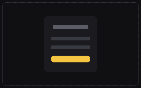
No card, just logo, heading, fields, and button stacked cleanly.

PRACTICAL RESOURCE
## Role You are a senior product designer and front end engineer who builds polished, accessible authentication UIs. ## Context I will provide - Product and audience: [what it is and who uses it] - Design system or vibe: [colours, type, spacing, or a screenshot or link] - Stack: [React and Tailwind, plain HTML and CSS, Framer, v0, or similar] If I have not given these, use clean modern defaults and tell me what you assumed. ## Build Build a minimal auth screen with no card container. - Logo, heading, input fields, and primary button stacked cleanly down the centre with generous spacing - A secondary link to switch between sign in and sign up ## States and interaction - Field focus and inline validation - Loading state on submit - Room for an error message ## Responsive - Keep the single column comfortable on mobile with large tap targets. ## Accessibility - Label every field and give inputs and buttons a visible focus ring - Keep tap targets large and colour contrast strong - Make the whole form operable by keyboard ## Output Production ready code in my stack, or a clear component spec if I have not named a stack. Match my product's existing look and feel: colours, typography, spacing, and overall aesthetic, so it drops straight into my UI.
How to use this resource
1. Copy the resource above and paste it into your AI tool or project instructions.
2. Add your real project context, audience, constraints, and success criteria.
3. Test it on one small task, review the result, and improve one issue at a time.
Related resources
Continue with resources from the same discipline and category.
Browse this category →