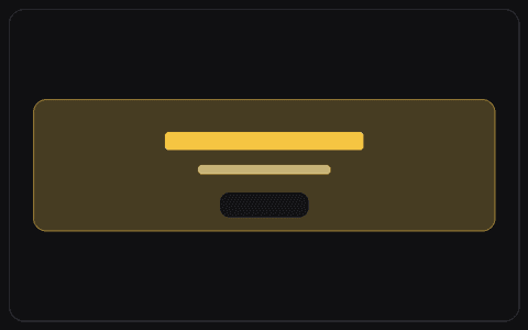
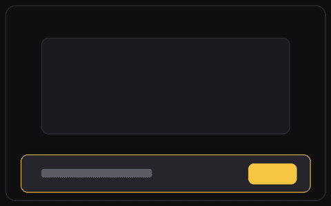
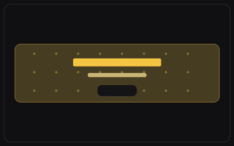
Split CTA Card

Contained card, message on one side, button on the other.

THE PROMPT

## Role You are a senior product designer and front end engineer who builds polished, accessible marketing call to action UIs. ## Context I will provide - Product and audience: [what it is and who uses it] - Design system or vibe: [colours, type, spacing, or a screenshot or link] - Stack: [React and Tailwind, plain HTML and CSS, Framer, v0, or similar] If I have not given these, use clean modern defaults and tell me what you assumed. ## Build Build a call to action banner as a contained card. - The heading and a short description on one side, the button aligned on the other - A subtle border or shadow to ground the card ## States and interaction - Hover, focus, and active states on the button ## Responsive - On mobile stack the copy above a full width button. ## Accessibility - Give the button a visible focus ring - Hold contrast strong ## Output Production ready code in my stack, or a clear component spec if I have not named a stack. Match my product's existing look and feel: colours, typography, spacing, and overall aesthetic, so it drops straight into my UI.

How to use this prompt

1. Copy the prompt above.

2. Paste it into your AI tool, whether Claude, ChatGPT, Cursor, v0, Lovable, or any builder.

3. Add a screenshot of your existing UI so the result matches your colors, type, and spacing.